Print & photo
Riso Palette
Risograph prints are known for vivid, slightly grainy ink on uncoated paper. This palette uses two of Riso’s official ink colors, Fluorescent Pink (#FF48B0) and Blue (#0078BF), plus black, on a warm paper white. Below are the hex codes, how a risograph prints, and a free way to give any image a riso look in your browser.
- Colors
- 4
- Year
- 1980s
- Process
- Riso digital duplicator
- Match
- By brightness
The 4 Riso colors
Pink and blue are the screen values Riso publishes for its Fluorescent Pink and Blue inks. Real ink looks different on every paper, and fluorescent pink is brighter than any screen can show. Black is pure black and the paper is an off-white chosen for this palette.
Download:HEX file of Riso pink & blueGPL file of Riso pink & blue
| Swatch | Name | Hex | RGB |
|---|---|---|---|
| Paper | #F2EDE4 | 242, 237, 228 | |
| Fluorescent Pink | #FF48B0 | 255, 72, 176 | |
| Blue | #0078BF | 0, 120, 191 | |
| Black | #000000 | 0, 0, 0 |
How a risograph prints
The Risograph is a digital duplicator made by the Riso Kagaku Corporation of Tokyo. It scans or receives an image, burns it as tiny holes into a thin master sheet with a thermal head, wraps the master around an ink drum and pushes ink through the holes onto paper, page after page, quickly and cheaply.
Each drum holds one ink, so a print in two colors goes through the machine twice, or through a two-drum model once. The inks are semi-transparent, so pink printed over blue makes purple, and the layers never line up perfectly: that slight misregistration is part of the look zines, posters and art books adopted.
Why riso is already dithered
A master either has a hole or it doesn’t, so a risograph can’t print a gray: every tone is a pattern of dots, from a halftone screen or a grain-like diffusion pattern. That’s why dithering and riso go together so well, and why a dithered image prints on a risograph much as it looks on screen.
This palette dithers the image to all four colors at once, by brightness. It gives the riso look on screen, but it doesn’t separate the inks or mix overprints: to print, make one grayscale layer per ink, for example by dithering a copy of the image in 1-bit for each color.
How to make Riso-style images
- Open the editor with the Riso palette selected. It matches by brightness.
- Choose Halftone for a classic print screen or Blue Noise for an even, grainy texture.
- Adjust contrast and gamma until the pink and blue land where you want them, then save the PNG at full size for print or ×2 for screens.
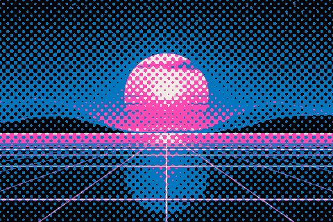
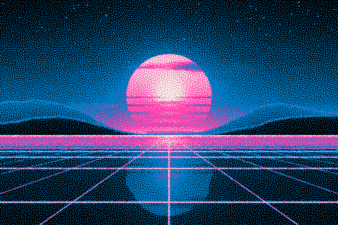
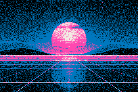
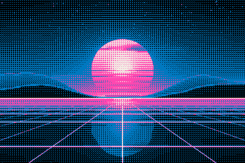
The Riso palette with different dithering algorithms
The same sunset at 480 × 320 pixels, shown at actual size.
Try the Riso palette on your image
Open the editor with Riso pink & blue already selected, drop in a photo or an animated GIF, pick a dithering algorithm and export a PNG or an animated GIF. Free, no account, no watermark, and your image never leaves your device.
Open Riso pink & blue in the editorRiso palette FAQ
Can I print this file on a risograph as it is?
Not directly: a risograph needs one grayscale layer per ink. Use the palette to preview the look, then dither a 1-bit copy of the image for each ink and send those layers to print.
Why does fluorescent pink look duller on my screen?
Fluorescent ink turns ultraviolet light into visible pink, so it glows brighter than any color a screen can make. #FF48B0 is Riso’s screen approximation.